I’ve been fretting over paint since we moved in.
What color do I want my Family Room? It shares walls with the breakfast area as well as the kitchen so I need a good neutral color that will go well for the majority of the downstairs of the house.
Do I want tan or gray?
Well, I finally narrowed my selection down to one of these:
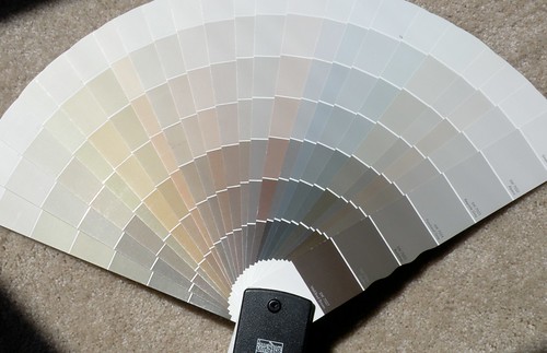
I am so indecisive!! Why can’t I just pick a color already and move forward?
I don’t know why I have such a hard time with this. Colors are not my strong-suite. I can confidently replace a sprinkler head, but when it comes to picking out paint colors and accessories for a room, I get hot flashes!
I’ve been loving on House*Tweaking for awhile now, so when she finally posted her house paint colors, I wrote them down and hit Lowe’s.
I bought 6 sample paints – 1/2 pint samples – (which were more expensive than I thought they would be. They were almost $4 a sample!)
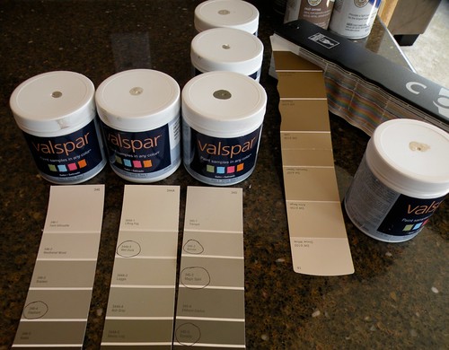
They are all Valspar brand.
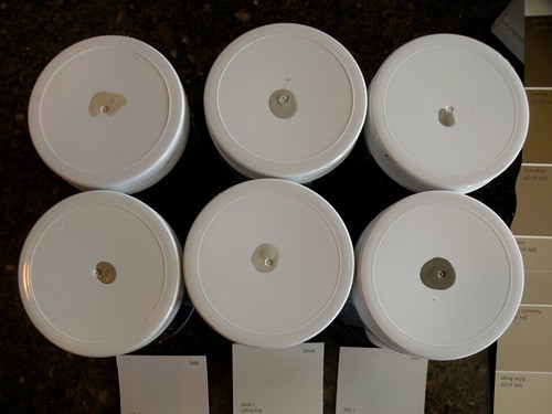
L to R back row: Kilim Beige – SW color that I had them color match, Bonsai, & Magic Spell
L to R front row: Elephant, Wet Dock, & Dynasty
Here is one wall in my family room. Most of the colors in this house are this taupe color and an adobe orangish color.
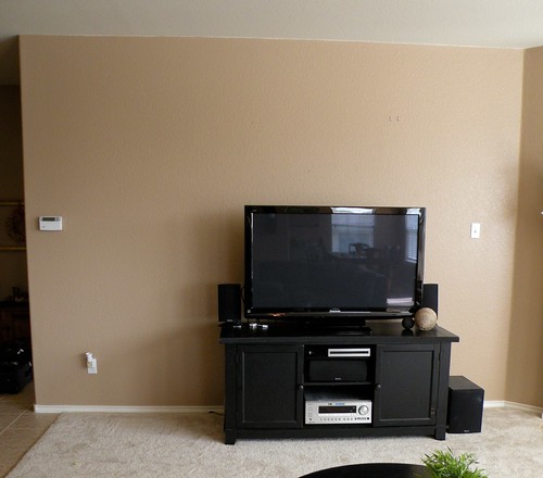
This color really isn’t bad. I kinda like it actually. But it’s in semi-gloss so my walls are super shiny. Also, I really want something a lot lighter and even more subtle and neutral in here.
I raced home, and immediately painted stripes on my wall.
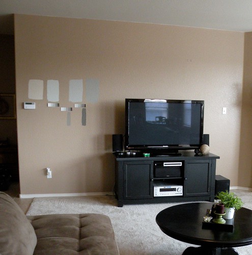
I’ve been staring at these stripes for about a week now.
I’m really glad I decided to try out some samples first, because I was convinced I was going to paint everything the Bonsai color (2nd from right), but I swear, in my house, there is a hint of blue in this gray. It doesn’t look blue in House*Tweaking’s photos. Maybe the tan underneath is glowing through making it look a different color?
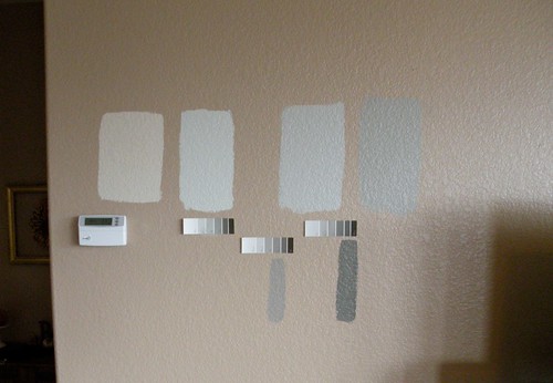
I’m going to do some accents in a really dark color, hence the dark stripes on the wall. But overall I want it very light and neutral.
I’ve decided I want gray after all, but I went ahead and got a sample of the SW Kilim Beige (far left) because that is usually my go-to color. I love it. It’s a very light neutral tan that looks great with anything. I painted my ENTIRE old house this color and I LOVED it.
But I really want to branch out and try gray.
Now I’m frustrated because I bought 6 colors and I’m not liking any of them!
Do they look BLUE to you?
Back to the drawing board!
Decor Chick just painted her dining room with gray, so I may get a sample of her gray to try out which is mindful Gray by Sherwin Williams.
I’ll pick a color eventually.
I’m sure going to have fun finding things to paint with my little 1/2 pint samples. There’s just enough in there to tackle a small project.
For now I’ve got a great little art statement going on in my living room. I’m afraid I may live with this for months!

And WHY OH WHY does the Bonsai look blue in my house, but gray in House*Tweaking’s house?


It looks gray because it’s up against a very tan wall. I guarantee if you take what’s left of the sample and paint a larger board and put it against the carpet, or against the ceiling, or on the corner, it won’t look blue.
I agree- it looks blue, but maybe because of the color underneath. You are smart to try, though, and be sure to look at the color in different lights in different rooms… my neighbor chose a gray for her house, painted a swatch on an exterior brick wall, lived with it a few days, so went with it… but because of the light on other walls throughout the day, my friends refer to her house as the ‘purple’ house:) You don’t want that to happen! I do love the gray from decor chick!
I agree with Heather.
Paint a larger area before you decide. Or do you have a favorite fabric in your home or a favorite article of clothing in the gray color you are looking to achieve? You could always take the item to a paint store and they can beam it (I have no idea what they actually do) and then blend a paint for ya.
Hey did you see my other post “what is your favorite gray?” There were several colors that readers mentioned that they said are straight up gray. I want to get samples of them all. Thanks for the shout out!!
They ALL look blue to me – but that’s because they’re surrounded by an orangey tan. Blue & orange are complimentary colors and bring out the undertones in eachother. so if you have a blue-ish grey, it’ll SURELY bring out the blue while it’s surrounded by that tan color.
Can you paint a larger square white (even if just primer) and then put these on top of that and take a photo of just the white square w/ the samples? that might give you a better idea.
I really like the first color sample. Maybe you can accent with one of the darker colors on an accent wall or with some furniture?
You need to paint bigger swatches!!!! I would think that the area that you committed to all of those colors should have been the space you gave just one color. I have nomadic desert, (which is on the same chip as your kilim beige, just a little darker) throughout my house and have been
super happy, I can use cool or warm accents with no problem… Can’t wait to see what you end up choosing!!! Good Luck
Paint colors might be one of the hardest decisions to make in anyone’s life. Committing is so difficult! You’re not alone – I’m still living with “contractor tan” all over my house! At least you have samples! That’s a good first step!
PS – gave you a blog award! I am always learning something useful from you!
Come and see!
http://itstoilegood.blogspot.com/2010/09/and-awards-go-to.html
I’m right with you on being commitment phobic with paint colors. I had lived most of my adult life in an apt with white walls. When we bought our house I swore I was not living with white walls any longer. But here it is 5 years later & I still have white walls as I can’t decide on a color. I’m hoping to pick one out by the year 2020.
Paint decisions are SO hard! We just did a renovation and our house got painted Grey Mist by Benjamin Moore. Oh how I love it. I’ve been asked a couple times if it has a green undertone and my reply is “I hope so”. But maybe that’s because of my fabulous 10’x 4′ green island.
Go with your gut. Whatever you choose you will love it. Big help I am hey? LOL.
You should go check out http://www.colourmehappyblog.blogspot.com. It’s an amazing blog by a woman who specialzes in color and there is some awesome information about colors and their undertones. There is specific information about gray. Also, for sure check out
http://granvillehouse.blogspot.com/2009/06/great-paint-resources.html
It had fabulous information that would be helpful when trying to pick a paint color. I personally love the paint by Restaration Hardware, they have some great nuetrals. I hope this helps a little. Good luck!
Natasha took the thoughts right out of my head! Paint a bigger area white and then put your samples up. I have about 10 jars of Valspar samples from Lowes and I ended up going with a Martha Stewart color from Home Depot! Committing to a paint color is so hard because you know you aren’t going to want to go through all of that work for nothing. When I got the MS color I painted three very large areas of the family room/hallway in different areas so I could see how the lighting affected it. I definitely think your current wall color is skewing the sample colors, though. Good luck!!
Benjamin Moore – Edgecomb Gray – It’s a Pottery Barn color and it looks tan where you need tan and gray where you need gray. It’s beautiful. THe pics of my powder room kinda show it –
http://cleanmama.blogspot.com/2010/03/monday-of-my-weekly-docket.html
it’s a tricky colour! we used the same grey colour in three rooms, and in each, it looked completely different…
against the white trim, it looked pure grey, against a cream trim (in a very sunny room) it looked blue, and in another room, it was blue-grey….here are some snaps:
http://buckcanuck.blogspot.com/2010/01/one-color-three-ways.html
I Love Paint
If I had a favorite thing, I’d have to say it’s paint
No matter what the shade is, I have no complaint
Each color has its use, we need every one
God has painted everything underneath the sun
A variety of tones and tints, so many you can choose
I could talk for hours about the different hues
Paint can cheer you up, change the way you feel
I become ecstatic when I see a color wheel!
With a roller or a brush I slap it on the wall
Then I start to smile, I love this most of all!
When God created color he had a wondrous plan
Yes I’d say it’s true, I’m a big paint fan!
Written by: Kala Cota
http://www.specialdaypoems.com
Good Luck with your project!!!
I vote for the first color too. Everyone seems to be doing gray now. I like Clean Mama’s color too. That way you can still have “warm” in some rooms and “cool” in others, depending on the light. I think a warmer color is always more inviting, but that’s just MHO. I have restrained gold by SW in my house and I get compliments everytime someone comes over. It goes with everything and it makes the space look rich and cozy.
It looks blue because it’s on a tan wall. I really like the lighter beige above the thermostat. It would brighten up that room & make it feel even bigger.
I’m not overly fond of working with grays because of winter (they’re LOOOONG in Utah) — even if the gray is a warm tone, if a room doesn’t have a lot of sunlight to help offset the gray, it becomes cold and depressing.
You’ll find a color soon that you’ll just LOVE, I’m sure of it!
♥hugs♥
Do you know how long it took me to decide on paint color for our house? One entire month of paint samples and moving them around from room to room! I would maybe suggest buying some white foam board from any craft store and painting your sample paint colors on those (1 paint color on each!). The foam boards can be easily moved around your house and are large enough to get a truer feel for the color. And don’t feel like you HAVE to use Bonsai just because you like my house. It may look a little different in your home depending on the amount of natural light you get and what other colors/wood tones you have going on. We get a LOT of natural light and have mainly neutral decor (dark wood tones, dark leather sectional, white trim, white kitchen cabinets, black countertops, light flooring, etc) with pops of green. This may further help my Bonsai walls to appear more gray than they would in someone else’s home. Don’t give up! I have tried many paint samples that were used in other people’s homes that I was disappointed with in my home. When I decided on Bonsai, it wasn’t because I’d seen it somewhere else…it was the color I liked after trying many, MANY paint samples. Good luck!
Hey thanks for doing the legwork for me and posting your paint sample search! I’ve been struggling to decide on a color for one room, and I think seeing the Kilim Beige on your wall has sold me! Thanks!
[Good luck to you deciding – all your choices look great, I think]
I went through this whole stressful situation too this past summer…I didn’t want tan because EVERYBODY has tan. I felt it would be too plain. But I didn’t want gray-gray…or green-green…know what I mean??? So, at Lowe’s I found Carriage House Fioli ( I think that’s the name). It’s a cross between a green and a gray, but it leans towards the tans in the color spectrum. I’m really happy with it. If you want to see what it looks like, take a peek at my blog. Maybe that will help you decide a little more….hope that helps! -Paige
Hi Allison, we have a light tan color in our living room and hallways and love it! It is called Hopsack by Valspar.
Unrelated blogging question: Do you use openid? Do you know how to get your display name in openid to say yourname @ your blog name? I would really like to get my openid to say Emily @ LaForceBeWithYou instead of http://www.laforcebewithyou.com which is what it says now.
Is that the same hopsack as sherwin williams? Lightest to darkest on the sherwin williams strip is Kilim Beige, Latte, and Hopsack. (all 3 of which I’ve used in a room together, and it turned out FAB!)
Hi. BH&G just did a story with greys and beiges. You might take a look at that.
Also, i saw a great idea somewhere– Paint a piece of foam board (white) with your colors and you can move it from room to room to see how it works with the lighting and no need to paint your walls till you are decided!
Have you seen how many shades of green I have puked up on my dining room walls, Allison? You do NOT want my input.
Let me offer you some advice from my years of trial and many errors in picking paint.
First off, you should get yourself some big poster boards. Paint 4 in 1 color and put them on each wall of the room. Live with it a day and a night.
Remember, many things will alter the way the paint looks. The background color that is already on the wall, the lighting, the furniture color and rugs.
I only have white light in my house. For flourescents and incandescents, I get the brightest or daylight bulbs. This will keep colors from looking muddy, especially those colors in the range you are looking.
When I was building this house I didn’t have the luxury of putting up poster boards and having my lighting installed. So I put up the poster boards in the house I was living in at the time and I put the samples under lamps that had the lighting that I would be using in the other house.
Also, you should not, if at all possible,use the 1st. or 2nd. lightest on the sample strip as they will look the least attractive on the wall. If you want color, then go with the 3rd. or higher on the strip. Another lesson learned when I tried to get a soft mauve years ago and ended up with Pepto Bismol pink!!
Good luck and I feel your pain.
We have kilim beige in all the major areas of our home and totally love it!
I would look at your major furniture pieces. I don’t like gray and browns together so I’d be hesitant to do too much gray on my walls if my furniture is in the brown family.
Also, I have learned the hard way (rental homes) that I’m very susceptible to the tones of the paint. I currently live in a home with little natural light in the main living areas and walls that have very cool undertones. It’s depressing almost all of the time.
I like the look of many of the grays I see people using, but I’ve yet to find a warm gray, so I’m steering clear of this color.
My upshot, the mood of the color is as important as the look of the color to me. Good luck.
My favorite go-to color is Tapestry Beige by Benjamin Moore. Everybody asks me for the name. It is soft and soothing and a great backdrop. I always use flat.
Hi, I see this conversation from a long time ago but giving it a shot, trying to find a nice neutral. I am looking at tapestry beige, we don’t get direct sunlight, is it fairly light, some warmth? I know that different light exposure changes it, will be in an open concept north facing and south facing. Thanks!
I wanted grey walls when I moved into my first house last year.. After 10 paint samples later. I ended up with a greige (Is that what they call a grey-beige?) and then I added in dark grey accents around my house. I also have a mocha microfiber sectional. I would suggest trying to find a greige. Which can go with brown and grey.
the color you NEED is Sherwin Williams LATTE. I’m telling you it’s THE best wall color in the world! When direct light hits it, you can hardly even notice your walls are brown, and when there isn’t direct light, it’s all warm and fuzzy feeling. Trust me. Once you paint a wall LATTE, you’ll never pick another brown again!
Yeah so maybe you wont want to hear my advice, BUT I think that if you put ANY of those colors on your wall, it will blend with the color of your carpet so much that you will hate it. The color you have now, at least in the picture has a contrast, and looks nice with your sofa. If you did a greyish, oh man, the room would look soooo washed out. Usually when people do a light grey or something their floors are hardwood, or at the very least a something to bring some warmth. I have also never been a fan of grey, as I find them too gloomy for MY taste. Just keep this in mind, and take another look at the pic, and the floor, you will see what Im talking about, Hope you decide soon, you don’t want the holidays creeping up, with striped walls, although that might be an idea too, lol. Some stripes. REAL stripes. Bella

I like the color already on the wall. It looks great with your furniture. I agree with some of the others about the gray and brown not looking good together.
Good luck! I remember trying to find the right color yellow and it took 4 tries. Paint samples look so different than the color on the wall!
I feel your PAIN!!! I am going through the EXACT thing. I am wanting to go gray but all the grays I am finding look blue not gray regardless of other homes having the color and it looking gray in their house! I am thinking I need to go a “greige” which is a taupey gray to get away from the blue undertones. I will let you know if I find a suitable color because I think you and I are wanting the same thing!
Oh and I have a SW paint swatch and I keep leaning towards the mindful gray as well, so maybe I will try that next!
I hate picking paint! It never looks the way I think it would! Good luck!
Do you remember the original taupe color that was on your wall before you painted?
I am doing the same thing now! We are completely renovating a house and I have bought 18 paint samples that range from grey to brown to beige (no joke) I just can’t commit to any color. I should add the living room has a fireplace that is tiled in a cobalt blue tile, and we just didn’t have the funds to do anything about that (yet). I have been leaning towards grey (with bluish undertones) but I am not convinced that is the right choice! Sigh…I may be living with primer walls forever.
May I have ask how you got the semi-gloss paint off your walls? I am having the same issue. I currently have a similar taupe color on my walls and want to change to a lighter color in a flat or eggshell paint, but am having trouble covering up all the gloss! HELP!
One word: primer. You will need to prime the walls first to get rid of that shine.
I know I’m late to the party, but I’m looking to repaint my kitchen walls. The cabinets are painted “Lincoln Cottage Black” by Valspar, the floor tiles are a light/medium tan/beige, and the back splash is mosaic glass 1″x1″ tile (that has smoky taupe, a silver/clear color, and a light smoky blue). I was thinking Valspar’s Bonsai or Magic Spell for the walls. The kitchen is not flooded with natural light either. Thoughts/suggestions? I can take and send a photo, if necessary.
I personally like really light grays and tans if you have dark cabinets and no natural light.