Friday I showed you the new table I added to the family room.
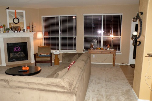
Today I’m going to expand on this and show you my vision for this room!
I took my poor-man’s photoshop, the GIMP, and created a few little edited pics to show you what I’m thinking for this room.
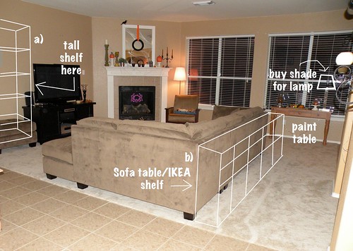
Here’s a break-down of my chicken scratch…
a) The LACK bookcase by IKEA.

I think this big chunky shelf will be perfect next to my TV unit.
b) The Expedit Bookcase from IKEA.
I want a table behind the couch, but it needs to be narrow AND long. Not an easy task!
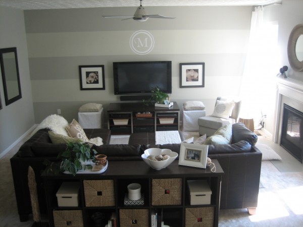
A few weeks ago House*Tweaking posted a picture of her family room, and low and behold she has the perfect table behind her couch.
I’m already planning on ripping off using her paint color, so I might as well steal this idea too.
I browsed IKEA and found the Expedit Bookcase, looked up the measurements, and lucky me!.. when you put two side-by-side they are a perfect fit for my couch!
A few other items I’d like to replace or purchase are:
1) the armchair area next to the fireplace.
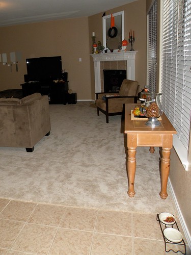
I bought this chair at a garage sale. I like the chair but I don’t love the location. It doesn’t work well in here but it’s better than nothing!
2) a new lamp for behind the chair. I’d LOVE a lamp like this one from IKEA:
But I think the arm is too big for the space and will hit the wall or the fireplace. I’ll find the perfect lamp soon enough.
Here is the room exactly as it is today.

And one more view:

I tried my hand at creating Mood Boards and came up with this:
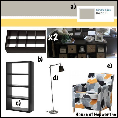
I liked the items I selected, but once they were on the board I decided I didn’t LOVE the items on the mood board.
So I swapped out the chair (KARLSTAD chair from IKEA) for a different chair. I also changed the color of the furniture to birch and white, and then chose a different wall color.
Here’s my 2nd Mood Board that I created (the new and improved board):
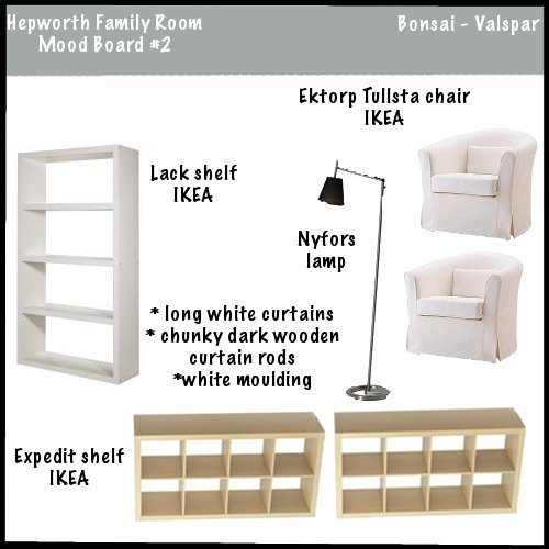
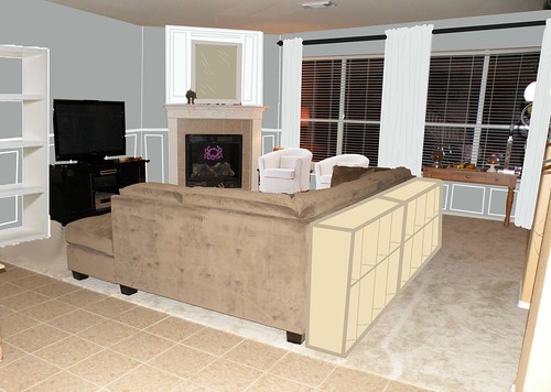
I wanted to make sure it was exactly what I am picturing in my head, so I played around with my photo editor and came up with my new living room:
In case you just did a serious double-take, here is my original photo before I edited it:

And again, side by side:


Can you believe it’s the same room?!
I painted the walls Bonsai by Valspar, added white curtains, moulding around the fireplace and along the walls, two shelves behind the couch, a tall bookshelf next to the tv, and finally two new IKEA chairs.
And once more, here’s the mood board and the family room next to each other. Hopefully this will help give a better visual.


There’s my current plan in a nut-shell!
Hopefully I’ll be able to get the ball rolling on this big makeover. I’ve got the plans down, now all I need is the cash!
How do you feel about the new plans for the family room?
Do you like the white and light furniture in the 2nd mood board, or are you more drawn to darker furniture?
What is your favorite decorating style?
If you could purchase one piece of furniture right and money wasn’t a factor, what would you buy? Why? Will you post a link to it so we can all see it?



I LOVE IT!………the paint color is gorg
Love it! Where’d you get your couch? Looking for something similar.
Fab-U-Lous! I was drooling over the paint chip samples at Home Depot yesterday and thinking about how I should use Photo Shop to test out the colors in my own room whenever the time comes to paint at my house. Your post assures me that making my own room mock-up is an AWESOME idea!
Looks great! And I bet you could find a great lamp at the new HomeGoods they opened in Austin!! Google it
Allison, love your ideas, but I believe I would go with black or dark shelves next to the TV to help camouflage the TV, in which case you would need some black on the other side of the room as well. I have my TV in a light-colored pine cabinet, but the darkness inside the somewhat deep cabinet helps camouflage the black TV, and I can close the doors if I want to. I envy you because you have waaaay more energy than I do. I can think of a thousand ways to improve my house, but none of them get done!
The new paint color really lightens up the room. It is going to look awesome!
The Gimp rocks! Nice job on the photo editing – I’m very impressed. Our living room is going to look so good once it is finished!
Your edited photo is amazing! Love it
IKEA…!
You will LOVE those Tullsta chairs. We have them in dark gray, and I think they’re the most comfortable reading chairs in the house. I like all of your other plans to add function and storage as well.
You did such a great job with your photo editing! I love the direction you’re going. But I would suggest building the Ikea bookshelves instead of buying them – it’ll be cheaper and you’ll have a nice end product. Here’s the link on Ana White’s page:
http://ana-white.com/2010/03/plans-2×4-rolling-cubbies-console-table-to-built-ins.html
You have some SERIOUS photo editor skills! That looks great….how amazing to be able really visualize before buying everything. It’s going to look great…can’t wait to see!
Allison!! Gah. You can’t call it THE Gimp. It’s just Gimp. If you call it THE Gimp, it brings to mind scenes from Pulp Fiction for some of us. And that’s not pretty. Nor does it make us want to download Gimp, which is really a wonderful FREE product.
I love the look but I think that the tall white shelf next to the small black entertainment center makes it look really cluttered over there, plus there is so much white that the black looks out of place, especially if you paint the sofa table (shelves) anything other than black or white. I would nix the idea of the whitle shelf by the tv and instead look for an armoir unit in either white or black and something that has doors to close and allow for a more polished look. Make it baig and chunky but not too deep so that it will fill the space without over powering it. Personally I’d go with white on the furniture and then you can acessorize with black, or any other color for the holiday/season and it will really pop in the room. It looks like fun and I’m really glad I don’t have what ever program you used or I would NEVER be able to leave my computer, although….
I like the idea of the room. I would get the drapes from Ikea too! Dang they are so cheap there, and you get a ton of yardage so you can hang them really high. Yeah, maybe you should get cabinet fronts for some of the shelving…that was a good comment. Me, I would buy from Ikea, that looks too difficult to make for the price Ikea charges. I wonder, can you put two small skinnier shelves on either side of the tv to balance it all out rather than the one tall bookcase? Just a thought. I just purchased a dream piece of furniture, and no one in my family likes it Haha. I just posted about it on my blog. I am keeping it no matter what anyone says, I love it. {plus I can’t return it}
My two favorites are the Ikea shelves behind the couch (genius!) and the added molding (?) or whatever is on the mantel. Looks great! Can I agree with some of the others and say move the black entertainment center the TV is on to another room? Maybe you have a dresser or something already in your home that would make a TV stand. I saw a dresser or table in your dining room in another post, but I’m not too sure if it is big enough. Just a thought….
So many possibilities!
Such fun projects in the works! I think the ikea expedit behind the couch would be great if they aren’t too wide (they are about 14 inches deep, but if you do put them there I wouldn’t keep the new table under the window. It would move it upstairs. Of course, I should see it in person to get a good feel! ;D
Oh, and the paint and moulding will make that room unbelievable gorgeous!
Loving the paint color!! So stunning!!
I love what you want to do to your living room! Very cool! And the wall color is perfect!
Me…well I would like to move everything out of the living room and start all over again. Just clear it out!!
And maybe visit Ethan Allen and see…..wishful thinking…I know!
Ha!
Hugs
SueAnn
Your mock-up #2 looks great! I like the idea of adding in some pops of white: shelf, curtains and chair. But, then again, my sons think my favorite color is white…bc I paint nearly everything white. Can’t wait to see how it all turns out.