I have a treat for you guys this weekend! Dream Book Design is here to share her ah-freaking-mazing nursery makeover with y’all. And I know reading “guest posts” on blogs is kinda annoying, but trust me, this reveal is worth it. I have been a fan of Adri’s since the very first time I ever clicked over to her blog. She won me over with her card catalog makeover that seriously rocked it hard core around blogland:
Adri and I have since become friends and I just really want to share how freaking fabulous and talented she is. Enough of me blathering on… let’s hear it from her.

Hello beautiful House of Hepworth readers, I am your new friend Adri from Dream Book Design! Allison was sweet enough to let me take the floor today, and I am excited to share a room near and dear to my heart.

Have you ever created a beautiful room, perfected each detail, poured your heart and soul in to it…and then move homes a month later? Haha, well my little family has! Our sweet son was born in May, and like any normal DIYer, it took us months after he was already here to finally finish his room. We completed it, and a month later we decided to move on to our next project of a house. But I still love the room so much, so thought I would share our process with you.
The nursery started out as our guest room. We had already added crown, baseboards, window trim, and fresh coat of paint. Other than though, the room was as basic as can be.
We had a unique situation with the closet. We knew that this room was going to be a nursery for as long as we were in that house, and no baby needs a huge deep closet, which was what we had. We decided to change the closet in to a reading nook with a deep storage bench and a rack for clothes.
We also wanted to do board and batten in the nursery, so we had to smooth out the walls first since {by our personal preference} that is necessary for it to look great. The process was super simple though, which we always appreciate:)
Once we got the walls smooth, we added the board and batten.
We chose Van Deusen Blue in flat for the walls, and our favorite Behr classic white for the lower half. I love that his nursery isn’t your typical pastel palet. It was a little intimidating at first going with such a dark and bold color, but we absolutely love it. We also got all of the details from his room from auctions, eBay, Craigslist, etc. Here is the room all finished:

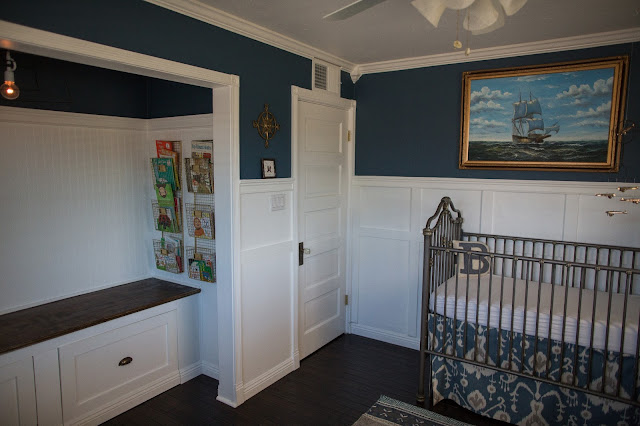
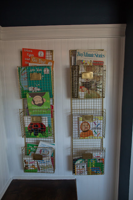
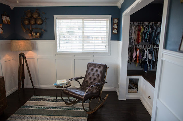
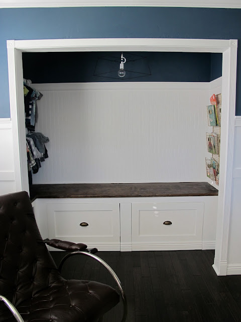
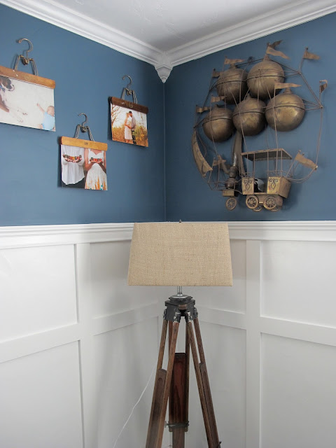
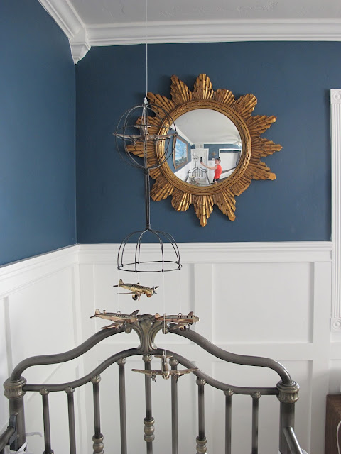
For a complete list of resources, go here.
Hope you guys like his nursery, and I hope it inspires you to ‘think outside the box’. Nurseries don’t have to be all pastels and alphabet prints after-all:) If you like this room, be sure to check out the tour of our old home, or the fun sneak peeks in to our new home. It was great meeting you today, and hope to see you over on Dream Book Design.


Hands down one of the most beautiful nurseries I’ve ever seen!!
This is gorgeous! There is so much visual interest and yet it still works for a baby too! Lovely! Have a wonderful weekend!
~Abby =)
So so pretty! I love the open closet! Gorgeous job!
That’s pretty ah freakin amazing like you said. love her picture/hangars and love how they made over the closet!
Ummm… wowza! Swap a queen sized (okay, maybe a king-sized) bed in there for the crib, and I’d be happy to call that my own bedroom!
Beautiful work. Love the reading nook especially.
Tara
suburble.com
My kids are grown and gone, but I can appreciate a nursery like this still! So awesome!
I love your closet turned reading nook! Fabulous idea!
Wow, this is GORGEOUS! So sophisticated for a nursery! And I must say, I LOVE that built-in bench in the closet. It could easily be converted back to a closet too (keeping those drawers for extra storage and adding a clothes rod). Thanks for the great post!
What an amazing room! Love the whole thing!