As promised, I am here to show you the new kitchen layout. I talked about our plans in my first “We’re renovating the kitchen!” post last week, but as per the usual, once I published the post with all my plans, I freaked out and changed all the plans. I’m very consistent in my inconsistency.
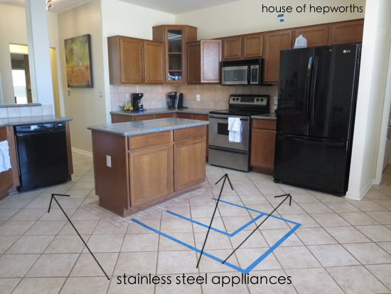
I’m going to show you several before photos first to give you a good feel for the space before I show you all the changes we are making. I used painters tape to measure off the new layout and live with it for a week or so to make sure I LOVED it before gutting my entire kitchen and building the new one only to find out I hated it. That would suck.
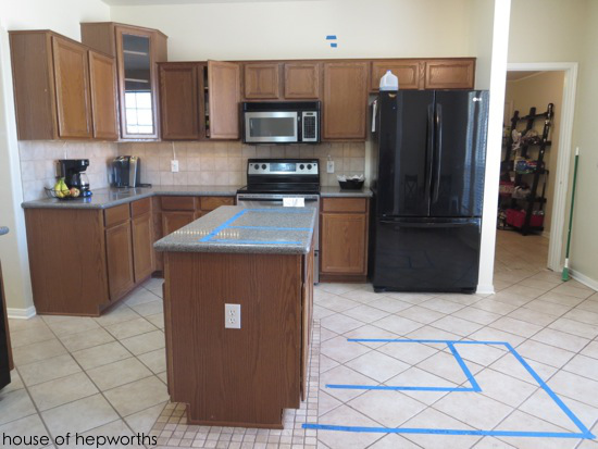
I have lived in this house for almost a year now and feel like I really have a good “feel” of the house and how we live here. There were times that I hated this kitchen, the layout, pretty much everything about it. But I’ll be the first to admit I was being just a tad dramatic.
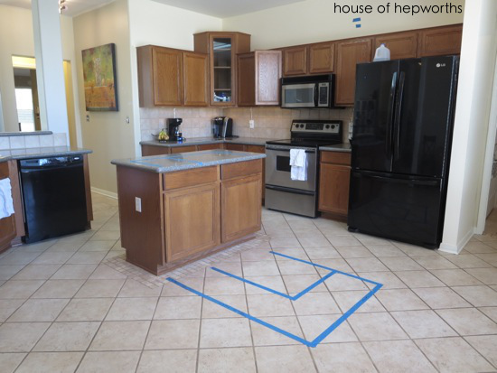
The kitchen layout isn’t really that bad, and once I stopped fighting against the layout of the house and started to try to work with the house, things started falling into place.
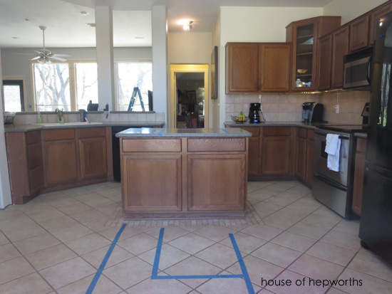
I spent months trying to design a kitchen that involved moving load-bearing walls, or adding an addition onto the house for a big breakfast room. I’ve drawn up every possible layout one can conjure up. At the end of the day? It just does not make sense to tear down half the house and move load-bearing walls. It is inefficient and costs loads of money.
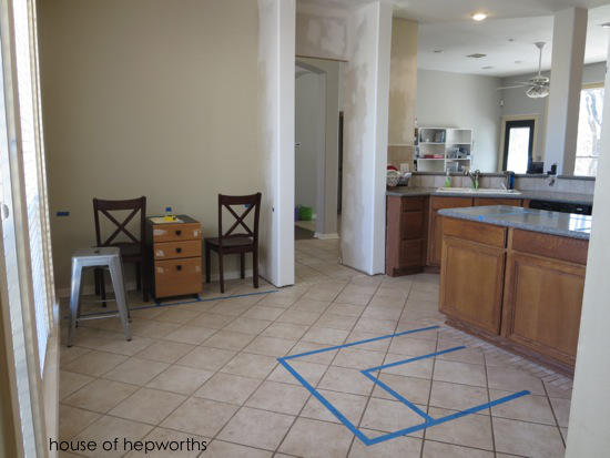
So that’s my new motto… to stop fighting against the house and start working with it instead. This new attitude has helped me to fall in love with my new home. The new kitchen renovation will just solidify that this is my forever house, I love it, and we are never moving again. We are working with the layout, but are just tweaking it to make it the best weird layout it can possibly be.
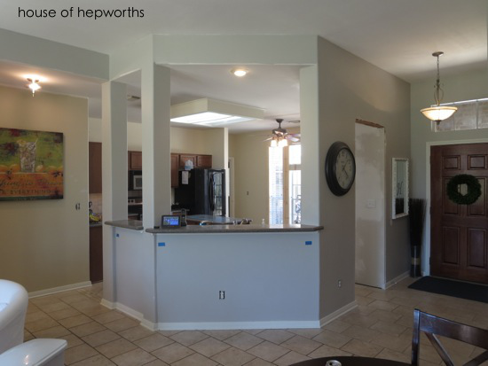
These columns have to stay because they pretty much hold up the entire ceiling. When we bought, I was like, “Oh, I’ll just take those out and open the space up! No biggie!” Um, yes, BIGGIE. They aren’t my favorite, but they are staying and I have some really exciting plans for making them look better.
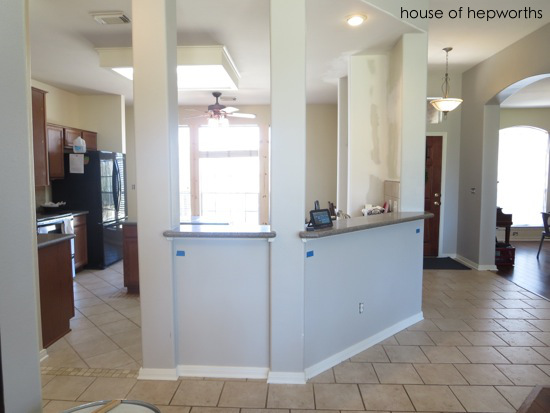
One more “before” of the kitchen before I get to all the new changes… Those big windows? One of my favorite things about this kitchen – tons of light and a great view of the driveway so I can watch the kids play.
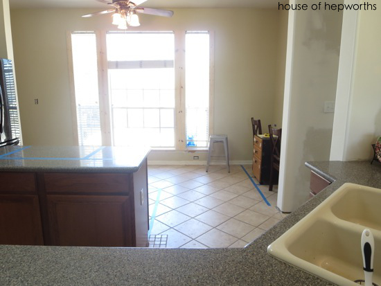
Are you ready to see my vision? I hope you like it because the cabinets are already being built as we speak. If you think of any really awesome change that I could sneak in real quick, I can probably make a few more little changes over the next couple days.
Remember when I said we were doing a separate tall oven cabinet? We aren’t. We were all set to do it, and after blogging about it I just couldn’t shake this terrible feeling about it. My gut was just screaming at me that I would hate it. So it got nixed. So did the appliance garage. We are sticking with a basic range, but trust me, I am much more at peace with this decision and am very happy about it.
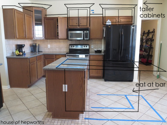
We are adding a huge island that will seat 4 people and will add a bunch more storage (plus a pull-out trash can!). All upper cabinets will be tall (42″ tall). The far left, middle, and far right cabinets will be 6″ taller than that. The fridge will have a box around it and the cabinet above will be the depth of the fridge (24″ instead of the standard 12″). All our appliances will be stainless steel (except we are keeping the fridge for a few months because we are already over budget. We will buy a new matching, possibly counter-depth fridge once we have the cash to purchase it).
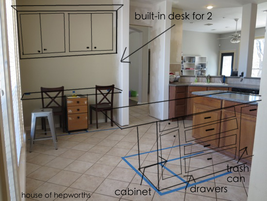
Looking from the other angle, the awkward area to the right of the window will have a built-in desk that seats two people. We spend a lot of time in the kitchen and it seems like a good space to have the kids’ computer. I will also use one of the spots for my desk and computer area. I’m getting tired of blogging from the couch or dining table and am really excited to have a designated space once and for all. Desks in kitchens don’t make sense for everyone, but it does for our family.
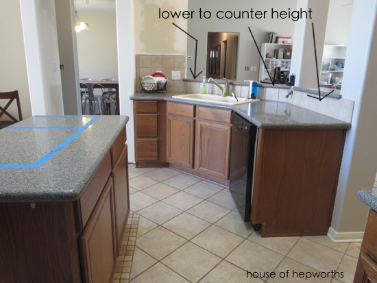
We are adding an in-cabinet pull-out garbage can to the island, but we also went a little overkill and added a 2nd smaller pull-out garbage can to the left of the sink. We need a garbage can next to where we do most of our food prep (the island) but we also wanted a small one near the sink, so we just said, “Why not?!”, and added both. We are also dropping the bar to counter height. The counter will extend between the columns slightly into the living room but will be one continuous counter.
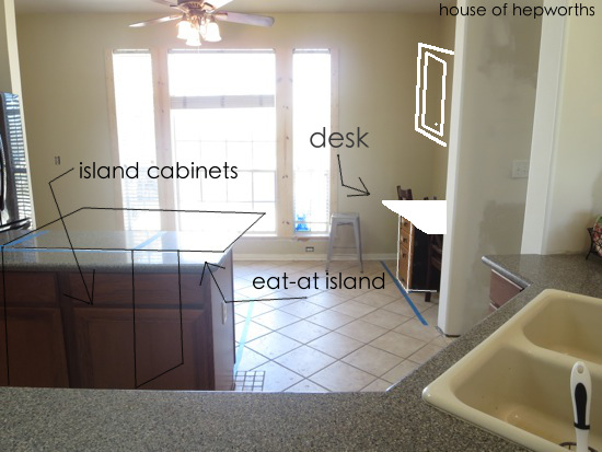
And one final “vision” one to help give you an idea of how everything will flow. After tons of research we made sure to leave about 50″ between the back of the bar and the sink and desk areas. That way there is plenty of room to walk through the kitchen even if someone is at the island and the desk at the same time.
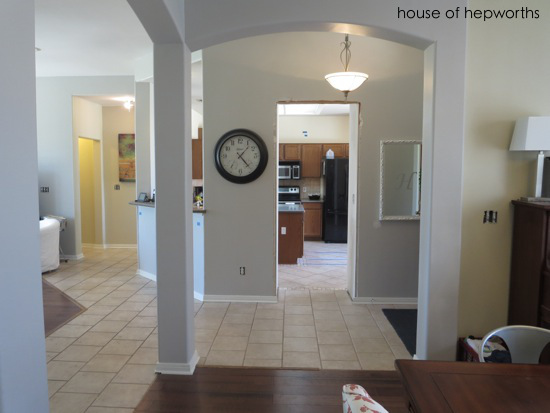
And here’s one final *bonus* photo of the kitchen looking in from the dining room. It doesn’t really go with this post but it’s here so I’ll just throw it in anyway, in case I’ve never showed this angle before.
As I mentioned in a prior post, the cabinets will be dark brown. We went with a very traditional raised-panel door. The wood is knotty alder so the doors will have a few blemishes and knots in them, which makes me weak in the knees. Here’s a very loose rendition of what our cabinets will look like:
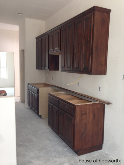
They look very red in this picture (taken at a home around the corner being built for our friends) but it was dark so I had to use the flash. In real life they are pretty dark brown. So there you have it. That is the plan, Stan.
To see the other posts in this series, start here:
1. Let’s Talk Kitchens. More Specifically My Kitchen Renovation.
2. Let the Kitchen Demo Begin!
3. More Kitchen Demo & Updates.
Or you can also just click on this –> Kitchen Renovation tag, but they display from newest post to oldest post. Thanks for following along, and as always, I really appreciate your thoughts and input. You guys usually give me the best tips and advice!


Love it!! I’m in love with that huge island and the desk center!!!
I think it looks great. I was confused about the depth of the over fridge cabinet. You said you might be getting a counter depth fridge in the near future. If you are boxing in the current fridge, will it look funny with a less deep fridge?
The cabinet and box around the fridge will only stick out 24″ (the same depth as base cabinets). Regular fridges stick out about 29″ from the wall and counter-depth fridges stick out about 25″ from the wall, so the counter-depth fridge will still stick out an inch further than the box around the fridge. Either size fridge will fit in a standard sized fridge box, it just depends on how far you want the fridge protruding into your floor space.
I have to tell you that when we did our big kitchen remodel 4 years ago, the designer did NOT love my idea of the pull out garbage. He really balked, but I stood my ground. Where else was I going to put it? I didn’t want to look at a garbage can sticking out somewhere, and didn’t want it under the kitchen sink. I know I do most of my food prep in this one area, and so it only made sense to have the garbage right under that area. I still think this was the BEST idea for the kitchen. Only when i have guests over do they wonder where the garbage is, but that’s ok. And my designer?? After he did our kitchen and took pictures of it, did he tell me that several others had now asked for this–hahah. I really LOVE your blogs, I just dont’ tell you. Thank you for the time you spend on them. Happy remodeling–Belinda
Looks great! I have no experience with kitchen renovations, but my parents went through a huge one a little while ago, and two things they did that they’ve really loved was to add outlets to their island, and to do separate pendant lighting above the island. They also had kind of hidden spice racks built into one of the cabinet ends – so it looks like the normal side of the cabinet, but opens up with a spice rack inside, but it ended up not being big enough to hold all their spices, so it almost doesn’t make sense to use because now half the spices are in a different location than the rest.
Molly, great tips! We will definitely be adding outlets to the island. We had two before and loved them so we will be doing at least two again this time around. I’m considering possibly even 3… We’ll see. The electrician is coming next week to work out all the lighting and we are going to have three different types of lighting going on (all on their own dimmer switches) – Recessed/can lights on one switch, pennants above the island on a 2nd switch, and under-cabinet lighting on a 3rd switch. I hope that gives enough variety for all our tasks in the kitchen. As for the spice racks, that’s my favorite part! We are adding 6″ wide base cabinet pull-out spice racks on either side of the range to hold all the spices and baking stuff like sprinkles, etc. I think that’s my favorite part of the entire kitchen. I guess I forgot to mention all those details in my layout post. I should do a follow-up post with all the fun little additions we are doing (spice racks, pull-out trash cans, two lazy susans (one lower, one upper), etc. Tons of functionality going in there.
I cannot wait to see how this turns out! I love the new layout you have planned! Woohoo for kitchen remodels!
Love it! Want to come design my house next? lol Thankfully our kitchen works great for me, so no changes needed there, but my basement is a total blank slate. Unfortunately, my brain is also a blank slate when it comes to what should go where down there!
The only thing I would consider is that if you lower that bar height counter by the columns down to counter height, it means everything on your counters will be visible at all times from that other room. So unless you keep the counters completely neat and tidy all the time, the mess will be visible from other rooms.
I know my kitchen isn’t always tidy so I like to be able to hide the mess!
Looks like an exciting renovation!
Woohoo! I’m so excited to see how this all comes out. You really do your homework!
KMac already said what I was going to say. I would like to be able to hide the mess that happens around my kitchen sink. Love all your functional details! It’s going to be beautiful!
Just wondering, with that photo you put of the view from the dining room, had you considered opening the entrance into the kitchen to match the wide opening with the arch into the dining room? May look nice and balanced. Just a thought.
Can’t wait to see the finished product.