One project down, 23 more to go!
Last week I gave you a peek inside my chaos that is my life by showing you 24 projects I should have finished by now, but haven’t.
It was the kick in the butt I was hoping for, and I’m happy to report that I can now check Project #10 off the list:
“Make and frame large family portraits for long neked wall”
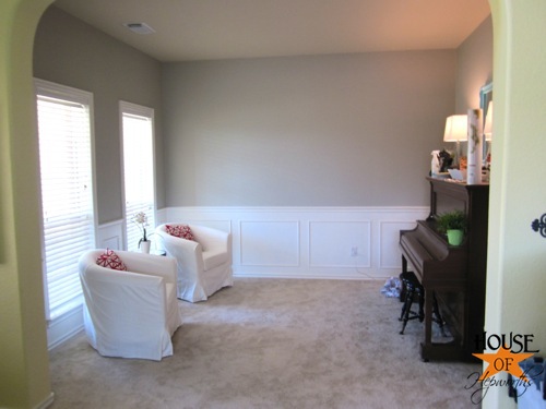
Here’s the before:
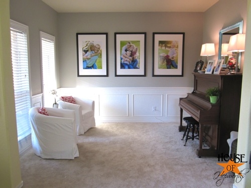
Here are my new framed portraits for my “neked wall” in the piano room.
And a close up…
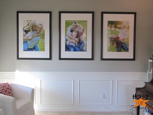



I chose these prints over any other for two reasons:
1) I needed pictures that were vertical. I easily narrowed down my selection to only ones that were taller than they were wide. And…
2) Formal Living Rooms are too stuffy for me. I wanted to lighten the look by adding silly playful pictures instead of the traditional formal portrait with pearls and the family golden retriever.
And now for the break-down of the project. How I created the look, how much time it took me, and how much cash I had to front for it.
I started with my pro-portraits, and then I went out and purchased the frames I wanted for the room. I wanted them to fill the wall and be HUGE, so these 32×40 frames from IKEA fit the bill nicely.
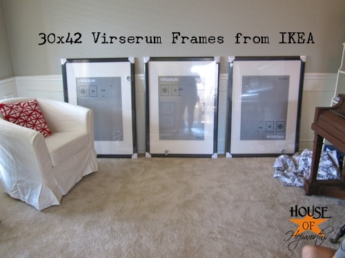
Before I entered the store, I measured my wall space then went online and researched all my frame options. The sizes of the frames are listed on IKEA’s website, so it’s easy to decide which frames will work best for your space. I measured twice before I dropped $30 per frame (which is a great deal, but when you are buying three at once it adds up!).
Next I used the measurements on IKEA’s website to determine how large my prints needed to be. They needed to fit within the mat inside the frame. Once I had my dimensions I headed to Costco.com (where I have an account) to check out their standard printing sizes and found the size (20×30) that matched my mat most closely. After a few clicks, the pictures were uploaded and ready for pick up the very next day.
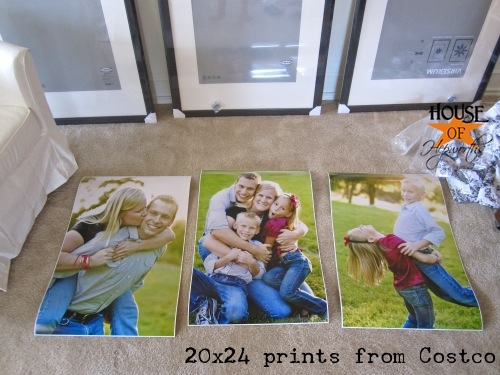
(The text on this photo is incorrect. It should read 20×30)
I might have squealed out loud when I went to pick them up. They were exactly what I was hoping for.
Next up, unwrapping the frames and carefully getting the prints into the mats without putting any dings in the frame or the pictures. Not such an easy feat when you are working with frames and prints this large.
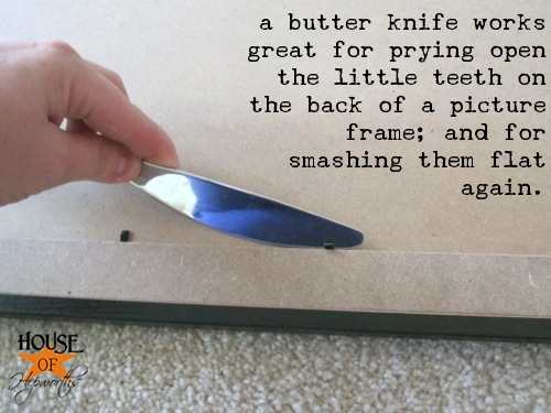
This is a handy little tip… When you have loads of those annoying little metal tabs to bend upward to remove the backing on your frame, use a butter knife. I’ve tried every tool I can think of, and the butter knife works the best.
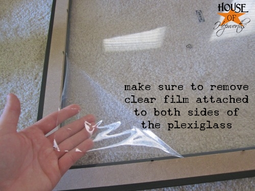
It took me a minute to figure this out, but the plexiglass in the frame comes coated with thin plastic on both sides to protect it from scratches. Make sure you remove all this plastic (carefully!) or your pictures will look cloudy.
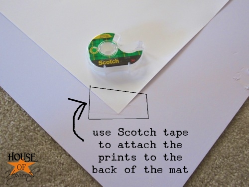
Once the plastic was removed from the plexiglass, I used Scotch tape to attach each portrait to the back of the mat. Pretty simple, but again, be careful because it is very easy to put a crease in your print.
Finally, I put the frames back together and I was finished! Or so I thought. I stepped back and couldn’t get over the horrible glare on each picture. Not to mention it’s totally impossible to photograph this room if the pictures have such a terrible glare. I guess that’s what happens when you are using cheap frames with plexiglass in them.
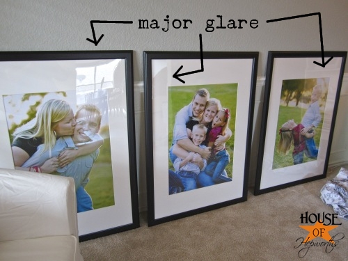
There was no way I was going to be blinded every time I walk past this room. I want to see my pictures, not the reflection of the light through all the windows. So, back to the drawing board. I finally decided to take all the frames apart again and carefully remove the plexiglass from each of them.
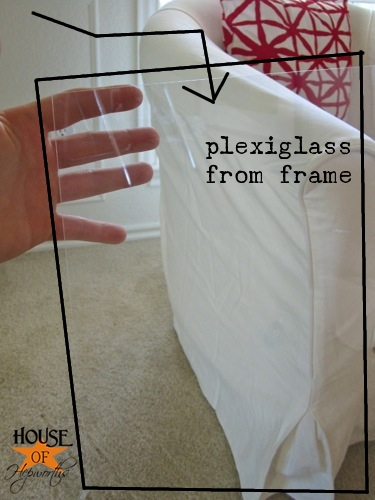
It was risky, and now the pictures are not protected. Also, they are not as stable as they were with the plexiglass inside holding everything in place. But this isn’t a high-traffic area, and no one is going to be touching them so I’m hoping they will survive glass-less.
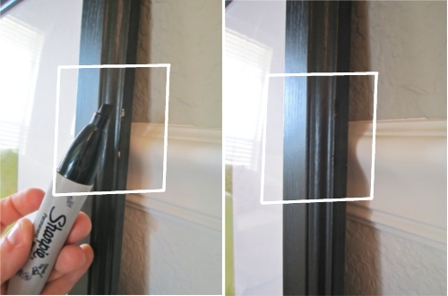
Also, one last thing. In the process of all this hoopla with changing out the frames twice each, one got a little nick in it. Not surprising considering their size and the fact that they are made out of particle board. It’s such an easy fix though, especially if your frames are black. My secret weapon? A sharpie.
Finally it was time to hang them. I don’t offer any quick and easy tips for getting your frames in the perfect spot. I used a tape measure and a level, and lots of math. First I hung the center frame, then I measured how far apart I wanted them and hung the other two. It took me a few nail holes to get them perfect.
And now, finally…
Before:

After:

I couldn’t be happier with the outcome! It’s exactly what I had in mind, yet at the same time, so much more than I was picturing.
And now a quick cost break down:
3 frames @ $30 a frame – Total: $90
3 20×30 prints @ $9 a print – Total: $27
Grand Total: $117 plus tax
Not to shabby considering I now have THREE huge portraits hanging in my piano room. And as for time it took me? I uploaded the pictures one evening, drove to Costco to pick them up, then drove to IKEA to purchase the frames. From there it took me about an hour or so to assemble the frames and prints and hang them on the wall. It was a pretty quick project.

Here’s a fun blast-from-the-past. Check out this waaaaaay before, and now today.
August 2010:
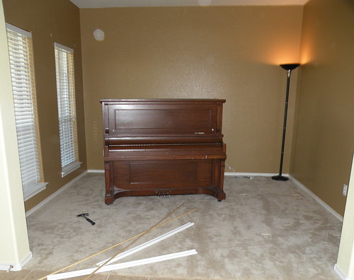
September 2011:

Definitely not finished, but sooooo close! Phase 1 should be complete by the end of the year (I hope!). (Phase 2 will consist of painting the piano and hanging crown moulding. Those projects so far in the distant future I can’t even see them yet.)
I love seeing the before pictures because it reminds me just how far this room really has come.
Do you decorate your home with pictures of your family? What are some creative ways you’ve displayed your photos? I’d love to hear how you’ve done it. Also, if you’ve blogged about it I’d love it if you posted a link to your project so we can all see it!

What a stunning transformation! Love the large scale framed photos for the room. Looks great!
Love it!! The pictures are great!!
Love it! It looks fabulous! I have a huge wall in the hallway that I want to fill with family portraits but that involves, well, having family portraits, oh and frames, frames are helpful too. lol.
I wish we were friends in real life so I could personally see the transformation of your home. Plus then you could give me some bomb tips and encouragement for decorating my home! haha
Looks beautiful, as usual. btw, I showed my husband your dining room makeover and he said “Wow, that looks MUCH better!
That room looks so beautiful now! I love the wainscotting too. You’ve inspired me to get moving on my 3 big empty frames sitting in my scrap room. I want to hang them on the stairwell. I’m glad you mentioned Costco. I wasn’t quite sure where to print such big prints. Any recommendations on hanging pictures along a stairwell?
Those are the perfect pictures for a piano room! I’m with you on the not so stuffy looking family photos! The room is coming along great!!
I love your beautiful photos!
It looks so great! I think that piano would look amazing painted green. My 10′ x 4′ kitchen island is GREEN! I recommend BM Brookside Moss. I can see it now!! Lol.
Looks great Allison! Love your family pictures — too cute!
Perfect choice and it transform your whole room in an absolute new look… it looks great now
Visit me if you can
http://craftaworld.blogspot.com/
Love
Farah
Looks great, Allison. If you’re worried about stability, you might try putting the plexiglass behind the pictures in the frame. That will give them some support and will keep them tight in the frames.
Wow! What a huge difference, it looks fabulous. LOVE the pics of your family, just beautiful. The room looks lovely!
Looks great! I’ve used foam board (I think that’s what it’s called), and used spray adhesive to bond my photos to it for stability in the past.
Perfect choice for this area! Love the pictures up close and from a distance!
Ya’ll are adorable!
gail
Looks fab-u-lous!!! I love the whole room!
I LOVE how the room looks! And those pictures are sooooo cute!!! I bet you just smile every time you walk by that room
WOW!!! It looks SO GREAT!!! I love this!!!
This looks amazing! I’m so doing this!
– Ellie @ Mammy Made
This turned out so great. I love the fun photo choices you made!
Hi Allison,
Been following your blog for some time now. Love it.
Your new nekked wall is now so pretty. Love your family portraits.
Could you share with me the color of your wall? I am in the process of choosing a light gray for my computer room/office.
Hard to find just the right shade. Want the walls to be light and going to paint the mismatched furniture a dark gray.
Thanks ever so much!
CaraRose
looks great ! as every one is commenting ! you know those photos look great right? they do…i would remove glare-y pexi also good idea !. I have heard of artists varnishing the photo or a print to a wood board and coating it with a clear satin finish… that would protect the photos …but I don’t know if that is too drastic for you. I do stuff t like you do with my sharpies too (the miracle pen )
Kat
I like!! Looks great.
WOW!! I love love love the family pictures in there- they go a long way to making the room look finished. I love the colors in them too; lots of fun shades to pick for your room accessories. I am a little scared about the piano though… painting it makes me nervous. I love the fact that it is dark while everything else is light and bright. Maybe you could leave it dark? To tie in with your dining room set across the way? I am sure whatever you decide to do will be
fab-u-lous. xoxoxo love you Allison!
Love it!! Wow! Once again, you’ve inspired me! …and utilizing two of my very favorite places on the planet…Costco and IKEA!!
Great seeing the transformation from original too.
Thanks for sharing!
Love Ikea frames! I think it looks great. Love that you used huge frames.
I love the three photo done this way on the wall. I need to do something like this..Cleaver and cheap! Your room look beautiful.
Wow, it’s amazing what adding a few photos can do for a room! Love it.
Great photos! Those look great on that wall.
Your pictures are awesome…
If you have the courage to take them apart once more ;^), you can put the plexiglass BEHIND the picture and it will solve the stability problem and give the picture some support as well.
Many thanks for your lovely blog!!
Do you have a post on the wall project? – adding the white bottom portion? How hard is that to do? Thanks! The pictures are great!
Yes, I’ll have to go dig it up. I’ll post the link here in a few minutes.